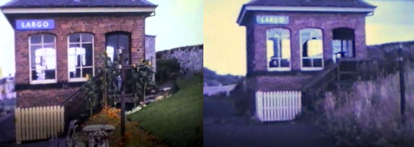
Above is a 'before and after' comparison of the signal box at Largo Station. On the left an image captured shortly before the station's closure. On the right the same view not long after closure, when the weeds and vandals had begun to make their mark. The last passenger train ran on 5th September 1965. Goods services were withdrawn on 18th July 1966. The line was officially closed on 18th December that year - although the very last train to run on the line was April 1967.
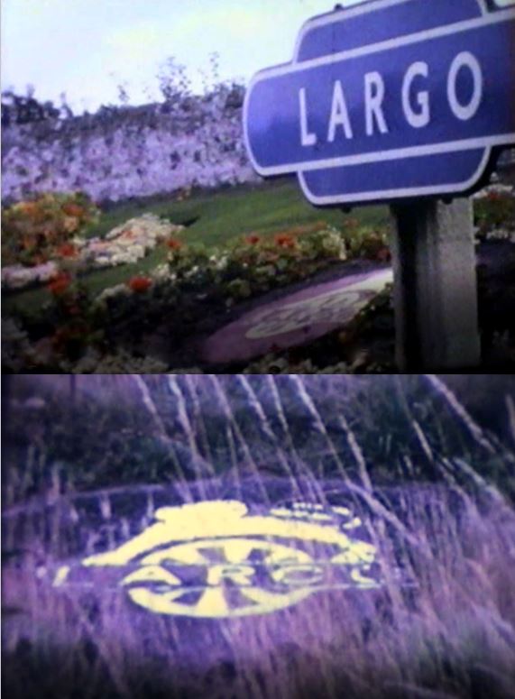
Below is a shot featuring the British Railways totem with the station name: 'Largo' (in the classic 'hot dog' shape). These station totems (and other signage such as the one on the signal box above) came in a range of colours, all featuring the Gill Sans font. While signs in Scotland were light blue, North Eastern was orange, Great Western Region was brown, the Midland Region was maroon, Southern Region was dark green and Eastern Region was dark blue. This corporate identity was introduced 1948/9 and was replaced in the late 1960s (post the Beeching cuts and too late to apply Largo or Lundin Links Stations).
The 'lion on wheel' emblem was also introduced in 1948/9 and can also be seen below on the banking among the flowers to the left of the totem sign. It's shown again below post-closure in an abandoned (yet still visible) state some years later. Further below is the official BR emblem upon which it was based.
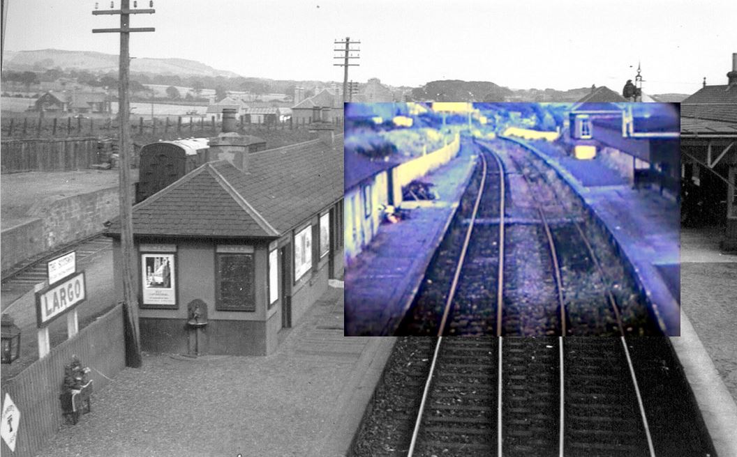
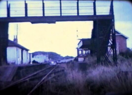
Below are some more scenes of dereliction at Largo Station. Firstly, some rather scruffy looking platforms and tracks superimposed on the same scene in better times (taken from the footbridge over the tracks). Next the levers inside the signal box, through broken glass. Finally, an overgrown track-side, looking through the footbridge. Around 1970/71 the Largo Station buildings were demolished.
More 'after the closure' photos of Largo Station are here and for Lundin Links Station click here.

 RSS Feed
